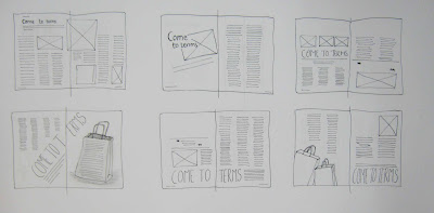
Experimenting with different layout designs by quickly sketching out thumbnails.
Below I have focused on using a lot of white space to create a minimal design:
Below I have tried to further my experiments with scale and designed some to be off-balance on purpose to see if it gave the spread a different feel.
I have decided to focus on this one as I like the simplicity of it and I think the title of the article can be quite bold using this design and I intend to use a different type from the one in the article.
Making a start on InDesign.
I have decided to add some colour to it to make it more aesthetically pleasing. I have chosen a simple typeface - Trade Gothic Lt for the body copy because it is modern, simple and legible. The structured layout still reflects the seriousness of the article.


No comments:
Post a Comment