Construction of a grid
Thumbnail sketches will make it easier when starting out.
Column grids are often used in newspapers and leaflets for example a 6 column grid. There are disadvantages of using a 6 column grid because the columns will be narrow and text size will have to be small.
The width of a column dictates the size of typeface used.
The rule: The narrower a column is, the smaller typeface.
Thumbnails
Always make a variety of thumbnails of layouts/ designs.
Do not rely on just one set of thumbnails
Enlarge a small selection of appropriate thumbnails by 1:1
Compare them and select and repeat process until you are confident with the design.
A grid is just a tool for a designer
Task for the next 3 weeks:
Design a concertina fold that is no littler than 5 panels, maximum of 16
Use a mixture of grids
You may use content from another brief you're working on
How to make a concertina booklet in inDesign
Make a multiple page document
Un tick 'Allow Document Pages to Shuffle' and 'Allow Selected Spread to Shuffle'
Then you can move the pages in the page view so they are lined up next to each other, voila!
Thursday 28 February 2013
Wednesday 27 February 2013
OUGD505 // What is Good Brief // Crit Feedback
- Good idea
- Strong concept
- Opportunity to experiment with pattern
- Opportunity to design different kinds of bunting kits according to age range eg children, teens, adults
- Research popular patterns at the minute for example aztec
Tuesday 26 February 2013
Studio Workshop // What is good?
5 Words that sum up your good
- decoration
- celebration
- english
- pretty
- patterns
5 words that sum up your target audience
- feminine
- shopkeepers
- young
- party hostess
- people who enjoy sewing
5 words that sum up your tone of voice
- educational
- informative
- light - hearted
5 products you could/ want to create
- 'how to make your own bunting kit'
- possible ' how to crochet your own bunting'
- magazine article to promote kits in women's magazines
- stationery
Processes I am interested in
- crochet
- stab binding
- laser cutter
- photography
Chosen Title : Things you need to know about bunting.
Product & Packaging
Stuck between either:
Retail & Promotion
Branding & Identity
Crit Feedback:
Good Range of Visual Research
Add some text to talk through why you chose bunting, look into the traditions & history of bunting
Good imagery & range of potential products showing the different uses of bunting
Labelling boards will help get a better idea of the range you want to create
Research the use of bunting in graphic design, would be interesting to see digital interpretations of the craft
What will your final products be? A publication, explore what size & shape you want the publication to be?
Think about how your designs can be used/ adapted as a concept so it can be used across different products
If you are creating a publication, think about the purpose of it & the tone of voice
What do you want to say about bunting?
Could it be a create your own bunting kit?
Bunting for different events?
Stab stitch binding is a good method of binding to explore for your chosen subject, explore either informal book binding methods you could do in addition
Monday 25 February 2013
Collaborative Brief // Ella's Kitchen
So today, my partner Katie Winter and I met up and analyzed the brief properly and brainstormed idea's together. What we gathered from the brief:
So we then went on to think up what could be in this tool kit considering the above points. Also considering the processes we'd like to experiment with. We came up with some possible products:
The Big Idea:
A wooden tree cut out on the laser cutter that could be hung with the fruit/veg/cutlery with the information on. We hope that the interactiveness of the tree will be sort of like a child's toy with the chunkiness of the wooden blocky vegetables etc and will convey an element of fun. We also think this would be more memorable than a traditional toolkit. It did say be inventive after all.
We originally thought that we could make a tree like the one below, but then we thought perhaps the others below with just one sheet of wood would be easier to transport.
The idea behind a tree could also communicate the idea of growing up to be big and strong just like the idea behind the organic baby food.
- They want us to design a toolkit for them to send to current and future stakeholders communicating their brand values:
- genuineness
- imagination
- inspiration
- Childlike: open, honest, imaginative, trusting, spirited and genuine (i.e. behaving like a toddler).
- Thinking differently: stand out from the crowd, open minded, confident, challenging and inquisitive.
- Good to each other: inclusive, approachable, self-aware, friendly, diverse and kind.
- Want to win: try to be top of the class, focussed, persistent, decisive and never give up.
- Business minded: sustainable, professional, grounded, accountable and knowledgeable."
- Their products are organic and they want children to grow up to eat healthily and so start them off from a young age eating healthy meals.
So we then went on to think up what could be in this tool kit considering the above points. Also considering the processes we'd like to experiment with. We came up with some possible products:
- Toy wooden milk van which Katie found on the website which was what they originally delivered the product in.
- Chunky wooden cutlery set: facts about brand values engraved into them
- Chunky wooden fruit & veg with facts about nutrition
- A paper booklet to include other important information
The Big Idea:
A wooden tree cut out on the laser cutter that could be hung with the fruit/veg/cutlery with the information on. We hope that the interactiveness of the tree will be sort of like a child's toy with the chunkiness of the wooden blocky vegetables etc and will convey an element of fun. We also think this would be more memorable than a traditional toolkit. It did say be inventive after all.
We originally thought that we could make a tree like the one below, but then we thought perhaps the others below with just one sheet of wood would be easier to transport.
The idea behind a tree could also communicate the idea of growing up to be big and strong just like the idea behind the organic baby food.
Sunday 24 February 2013
Responsive Collaborative // Ella's Kitchen
As I don't know an awful lot about baby food, I thought I'd take a quick look at what other brands are out there and what they have to say for themselves. I came across quite a few organic baby food companies.
Some have similar packaging as the Ella's Kitchen Brand.
The fruit & veg on the front of these packages conveys the idea of health behind this brand.
Thursday 21 February 2013
Type & Grid Workshop
Create your own double page spread using the knowledge learned in class today.
I began with with the canon van de graaf and split the square into 4 sections.
I then designed a grid of 5 columns with margins smallest on the top of 10 mm, 15 on the outside, 10 on the inside and 20 on the bottom. (I later changed the column structure to 4.)
I then started placing the imagery and titles. (I found the source image on Pinterest) and then followed on to the website to find information about the image. http://justshortofcrazy.com/2013/02/kiwi-avocado-smoothie-with-lime-and-honey/
The final DPS you can see below:
Type & Grid Workshop Notes
Rule of Thirds
Grids & Canons
Van De Graaf
The Van de Graaf canon is a historical reconstruction of a method that may have been used in book design to divide a page in pleasing proportions. This canon is also known as the "secret canon" used in many medieval manuscripts and incunabula. (wikipedia)
Below is my own attempt at the graph using inDesign.
Leading
There should be 7 words per line in a column according to empirical rule and the human eye can only read 30 - 35 cm away at a time.
Typography // Creating your own Paper Size
Fibonacci Sequence
0+2 = 2
2+2 = 4
2+4 = 6
4+6 = 10
6+10 = 16
10+16 = 26
16+26 = 42
26+42 = 68
42+68 = 110
68+110 = 178
Tuesday 19 February 2013
Bunting // Research a range of 5 products/ things
Consider:
Soap & Glory Lipstick package
1 - Good quality uncoated stock used, foiling used in elements
3 - Not a very heavy weight stock, wouldn't last too long
4 - Scored and folded, glued along one side then folds together
5 - Printed on medium weight stock could be foiled in industry or student environment
6 - I would make sure the fold was in the correct place so the colours were in the right place
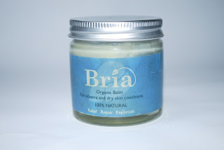
Bria Organic Skin Balm
1 - Good quality, glass - not plastic. Paper Label is a think stock
2 - Organic Product
3 - Jar - long lasting, paper label is already deteriorating, could do to be satin or silk
4 - Sticky Label Stuck to glass jar
5 -
6 - I would design the label out of a more durable stock
Paracetamol Pot (Be good for a pin/needle pot)
1 - Cheap plastic stock with inexpensive logo design
2 -
3 - Highly durable
4 - Pop on / off lid, anti - child lock
5 - Label digitally printed
6 - Design a more eye catching label
Accessorize Stationery
1 - Inexpensive plastic wrapping, card insert
2 -
3 - Safe against water damage and general wear and tear
4 - Simple clear plastic package
5 - Insert digitally printed, plastic heat pressed to seal
6 - I would add interest to the clear packaging somehow or make the insert more related
Birthday Card
1 - Good quality medium density stock
2 -
3 - Would last as long as it needed to as a card
4 - Unseal clear plastic insert card into sticky envelope
5 - Digitally printed
6 - I like the 'applique' style illustration, I would make the 'Happy Birthday' bolder
1. stock
2. sustainability
3. durability
4. how they are assembled
5. how it is produced (in both commercial and student environments)
6. what production methods would I want to do with it and why?
Soap & Glory Lipstick package
1 - Good quality uncoated stock used, foiling used in elements
3 - Not a very heavy weight stock, wouldn't last too long
4 - Scored and folded, glued along one side then folds together
5 - Printed on medium weight stock could be foiled in industry or student environment
6 - I would make sure the fold was in the correct place so the colours were in the right place
Bria Organic Skin Balm
1 - Good quality, glass - not plastic. Paper Label is a think stock
2 - Organic Product
3 - Jar - long lasting, paper label is already deteriorating, could do to be satin or silk
4 - Sticky Label Stuck to glass jar
5 -
6 - I would design the label out of a more durable stock
Paracetamol Pot (Be good for a pin/needle pot)
1 - Cheap plastic stock with inexpensive logo design
2 -
3 - Highly durable
4 - Pop on / off lid, anti - child lock
5 - Label digitally printed
6 - Design a more eye catching label
Accessorize Stationery
1 - Inexpensive plastic wrapping, card insert
2 -
3 - Safe against water damage and general wear and tear
4 - Simple clear plastic package
5 - Insert digitally printed, plastic heat pressed to seal
6 - I would add interest to the clear packaging somehow or make the insert more related
Birthday Card
1 - Good quality medium density stock
2 -
3 - Would last as long as it needed to as a card
4 - Unseal clear plastic insert card into sticky envelope
5 - Digitally printed
6 - I like the 'applique' style illustration, I would make the 'Happy Birthday' bolder
5 Products relating to Bunting
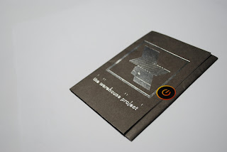
WHP Line up Booklet/ Poster
Target Audience - Young party people
Context - Found in clubs
How People Interact with it - Opens up to a poster/ booklet
Stock - Average quality stock, however better than normal flyers
Special Production Methods - Foiling used throughout, makes you want to interact with it and keep hold of it
Bunting
Target Audience - Wide target audience, generally women / used for celebrations mainly in Britain
Context - Found in shops/homes/cafes/outdoors
How People Interact with it - To be hung as a decoration
Stock - cotton/thread/bias tape
Special Production Methods -
Dub Weekender, Perforated Roach Flyer
Target Audience - People interested in dub/reggae/festivals/smoking
Context - Found in clubs/shops
How People Interact with it - People can read it/ keep it/ tear perforated lines to make card into roach
Stock - Perfect for roach as it is uncoated matte finish
Special Production Methods - perforated
Sample of Cover from Vice Magazine
Target Audience - 16 + people interested in strange/interesting articles
Context - Found in shops/ can be mailed out
How People Interact with it - to be held/read/ opened
Stock - heavy paper stock with spot varnish
Special Production Methods - Spot Varnish
Pukka Tea Packaging
Target Audience - Young health oriented adults
Context - Shops/ cafes
How People Interact with it - Open it up, find coupon inside
Stock - Quality stock, coated
Thursday 14 February 2013
Type Workshop 1 with Phil
Task:
Create a small publication to inform people of the rules of type using the knowledge we already have while also considering the format.
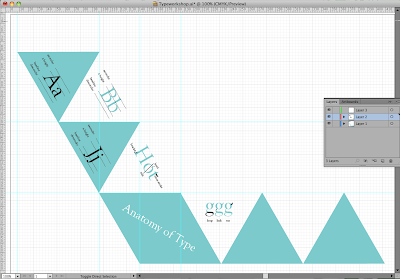
I wanted my booklet to be fold out and wanted it to stand out so I decided that a folding triangular format would work well. It took me a while to make the initial equilateral triangle in illustrator (it should have a triangle tool). I then started to fill in the content from previous type workshops that I remembered, also referring to this website: http://www.typographydeconstructed.com/
This is my publication design so far:
My initial Design was black outlined triangles but I decided to use bock colour as it looks messy when you fold things if it's not perfect and you can see the lines. The block colour generally makes it look more professional and neat. To pinpoint each thing eg ear, serif, counter, I created a clipping mask of the part of the letter I wanted to draw attention to and then layered it over the other letter.
Collaborative Responsive // Things we think
Ella's Kitchen Brief, collaborative partner: Katie Winter
10 things we think the same:
Similar Values
Love Organic
Both want to experiment with processes
Like the childlike feel
Both enjoy illustration
Laser cutting
Screen Printing
Interested in type
10 things we think differently:
Different design practice
Skills
Individual Responsibilities
Non - design skills
Concept idea's
Key Common things we want out the brief:
Childlike Feel
Fun and Friendly
Colourful
Gain clients
Experiment with Processes
Promote their initial values
Use new techniques
Add something extra to the brief (eg bibs, jigsaws)
3D element
Key Common different things we want out the brief:
Katie wants to do: 3D experimentation
Experimentation with textiles
Experiment with colour
Experiment with photography
I want to further my skills on the laser cutter (designs for laser cutter) if appropriate
Develop collaborative skills
Improve pitching/ presenting skills
Improve research skills
Improve type skills
Benefits of Collaboration
Learning new skills
Use your partners skills
Concepts and idea's from two perspectives
Can always blame someone else
Greater level of confidence in a team
Professional Personal Integrity (can't let the other person down)
Share the pressure
Confidence to take risks
Shared responsibility/ workload
Problems with Collaboration
Disagreement
Money/ Budget
Style/ Design Decisions
Workload
Broader Practice
Having to compromise
Poor communication
Select Brief
Think of Idea's
Re-written Brief - what are the problems you're trying to solve
Fill in project rationale
Concept/ Message
Specific Plan of what we're going to do
Wednesday 13 February 2013
5 examples of branding/ logo design relating to bunting
Handmade by LucyLu 'Make your own' Bunting Kits, £12.80
Type writer font gives a hand made feel
Feminine colours and decoration (flowers, gingham and polkadots) target a young female market that is quite fashionable at the minute
The product and packaging has a country cottage tea party feel
Cath Kidston
Versatile logo, usually red writing on either blue or white background and is often placed over bold floral patterns. The reds and blues are quite feminine and target a mainly female audience. The type face is a script font that is more inviting to the working class people than a serif font for example.
Liberty London
Liberty London is a very well known brand and is quite prestigious, you can tell this through the type face used and the grand illustration at the top which is similar to those on grand old buildings, this reflects quality and makes people trust the brand.
Laura Ashley
Serif font suggests quality
Subscribe to:
Posts (Atom)


