Friday, 14 October 2011

Designing a Typeface

The Brief is to design a full alphabet and 6 glyphs for my partner picked from the randomiser.  The design is to be hand-rendered and presented on an A1 poster, on true grain (trace paper).  We also had to base our type on an existing typeface.  To begin we carried out a small interview and from that I picked up that my partner Sophia:

  • Would like to live in either London or New York after our degree
  • Loves beaches as she's originally from Brighton
  • Went on holiday to Zante in the summer
  • Favourite smell is of the sea side
  • Hates moody people
  • Is scared of moths and butterflies 
I then sketched up a few idea's in my notebook before progressing to design sheets.


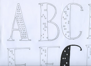
I decided on two main idea's to experiment with, one was the idea of beaches - using pebbles and palm tree's.  Another idea was the city, using tall buildings and city skylines to create a legible typeface.


Direct Research ^


Final Idea is a combination of the two images above.

For my final poster and name badge I used the font Garamond because it is quite bulky and allowed me to illustrate within the boundaries of the letters.




No comments:

Post a Comment