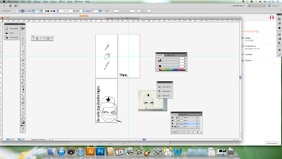
Here are some screenshots of my re-worked posters. The grey colour was chosen to link better with my mailshot design but think perhaps its too drab. The strong red colour helps to communicate the message of danger much better and is much more in your face and shocking.

Here are some main points for improvement:
- Experiment with colour throughout the posters to increase the meaning behind the message.
- Don't vary the width of lines in the illustrations as this makes it look unprofessional.
- Try different fonts to see if this can also help convey the message more strongly.
- Generally make them more bold and outstanding/ eye-catching.


No comments:
Post a Comment