Create a small publication to inform people of the rules of type using the knowledge we already have while also considering the format.
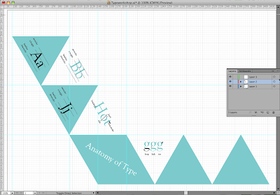
I wanted my booklet to be fold out and wanted it to stand out so I decided that a folding triangular format would work well. It took me a while to make the initial equilateral triangle in illustrator (it should have a triangle tool). I then started to fill in the content from previous type workshops that I remembered, also referring to this website: http://www.typographydeconstructed.com/
This is my publication design so far:
My initial Design was black outlined triangles but I decided to use bock colour as it looks messy when you fold things if it's not perfect and you can see the lines. The block colour generally makes it look more professional and neat. To pinpoint each thing eg ear, serif, counter, I created a clipping mask of the part of the letter I wanted to draw attention to and then layered it over the other letter.


No comments:
Post a Comment