Construction of a grid
Thumbnail sketches will make it easier when starting out.
Column grids are often used in newspapers and leaflets for example a 6 column grid. There are disadvantages of using a 6 column grid because the columns will be narrow and text size will have to be small.
The width of a column dictates the size of typeface used.
The rule: The narrower a column is, the smaller typeface.
Thumbnails
Always make a variety of thumbnails of layouts/ designs.
Do not rely on just one set of thumbnails
Enlarge a small selection of appropriate thumbnails by 1:1
Compare them and select and repeat process until you are confident with the design.
A grid is just a tool for a designer
Task for the next 3 weeks:
Design a concertina fold that is no littler than 5 panels, maximum of 16
Use a mixture of grids
You may use content from another brief you're working on
How to make a concertina booklet in inDesign
Make a multiple page document
Un tick 'Allow Document Pages to Shuffle' and 'Allow Selected Spread to Shuffle'
Then you can move the pages in the page view so they are lined up next to each other, voila!
Showing posts with label typography. Show all posts
Showing posts with label typography. Show all posts
Thursday, 28 February 2013
Thursday, 21 February 2013
Type & Grid Workshop
Create your own double page spread using the knowledge learned in class today.
I began with with the canon van de graaf and split the square into 4 sections.
I then designed a grid of 5 columns with margins smallest on the top of 10 mm, 15 on the outside, 10 on the inside and 20 on the bottom. (I later changed the column structure to 4.)
I then started placing the imagery and titles. (I found the source image on Pinterest) and then followed on to the website to find information about the image. http://justshortofcrazy.com/2013/02/kiwi-avocado-smoothie-with-lime-and-honey/
The final DPS you can see below:
Type & Grid Workshop Notes
Rule of Thirds
Grids & Canons
Van De Graaf
The Van de Graaf canon is a historical reconstruction of a method that may have been used in book design to divide a page in pleasing proportions. This canon is also known as the "secret canon" used in many medieval manuscripts and incunabula. (wikipedia)
Below is my own attempt at the graph using inDesign.
Leading
There should be 7 words per line in a column according to empirical rule and the human eye can only read 30 - 35 cm away at a time.
Typography // Creating your own Paper Size
Fibonacci Sequence
0+2 = 2
2+2 = 4
2+4 = 6
4+6 = 10
6+10 = 16
10+16 = 26
16+26 = 42
26+42 = 68
42+68 = 110
68+110 = 178
Thursday, 14 February 2013
Type Workshop 1 with Phil
Task:
Create a small publication to inform people of the rules of type using the knowledge we already have while also considering the format.
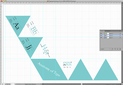
I wanted my booklet to be fold out and wanted it to stand out so I decided that a folding triangular format would work well. It took me a while to make the initial equilateral triangle in illustrator (it should have a triangle tool). I then started to fill in the content from previous type workshops that I remembered, also referring to this website: http://www.typographydeconstructed.com/
This is my publication design so far:
My initial Design was black outlined triangles but I decided to use bock colour as it looks messy when you fold things if it's not perfect and you can see the lines. The block colour generally makes it look more professional and neat. To pinpoint each thing eg ear, serif, counter, I created a clipping mask of the part of the letter I wanted to draw attention to and then layered it over the other letter.
Monday, 5 November 2012
Typography Research
It's interesting how the layout/size/placing of text can make you read words in different orders. The image below, I found on pinterest and couldn't find the designer. In our typography session we were set a task to design a proverb and make it read in the correct order but in a groovy way. We are allowed to use any typeface and weight, it has to be landscape and in black and white.
Thursday, 25 October 2012
Tuesday, 23 October 2012
Subscribe to:
Posts (Atom)


