I have really enjoyed the 505 Design Practice 2 module, more so than other modules so far this year. This is down to the fact that we based our projects on something that we were really interested in. To begin with I was slightly worried that "Bunting" perhaps was not the best thing to pick for the briefs, but through researching, I found a way that it could work for the briefs and possible graphic outcomes for the brief. I finally feel like I have achieved something to be proud of with this brief and I plan to carry on making bunting and other crafts to sell, not for charity but to put the money I make, back into making more products.
I feel like I have improved my organisation skills with this project, having to organise a place to sell the bunting, organise getting fabric donated while also designing the graphic design to go along with the project. Crocheting is another skill I have gained along the way which I wish to build upon in the summer holiday as there are so many things you can make out of crocheting and could be an interesting way to create graphic outcomes in the future.
In the future I wish to expand my product range and hopefully make enough so I have enough stock to start selling my designs and products at Craft Fairs. I am going to carry on making bunting, a few people have already asked me to make them some personalised bunting. I also wish to make more dream catchers, greetings cards, crocheted cushion covers.
If I had more time for the "What is Good" project I would have liked to have this product range available. Other graphic outcomes I'd like to design would be stickers or badges and possibly an article to promote the project in a local zine or newspaper.
Monday, 20 May 2013
What is Good // Bunting // Bookmarks
Instead of flyers, I thought an alternative way to advertise would be bookmarks. These can also be handed out to people who buy the bunting as a thank you.

Saturday, 18 May 2013
What is Good // Bunting // In Mamsys Thai Restaurant Hyde Park
Mamsy's Thai Restaurant in Hyde Park is a popular place for students to eat. It also sells lots of artists work (which you can see in the images below) which makes it the perfect place to sell my bunting!

The chosen advertising poster in the window:
To give you an idea of what the place is like where I will am selling my bunting from, I took some photographs of the restuarant.
You can see here what the restaurant looks like and all the art for sale on the walls:
Below is a Buddha which my friend was commissioned to paint
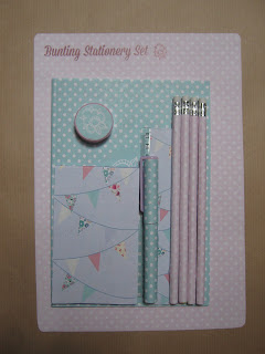
What is Good // Stationery
Final Images of the Final Stationery Set
Target Audience: Young girls ranging from 5-15 (although I'm 20 and would probably use this)
I am happy with how the stationery turned out. The colours are a bit more fade than how I envisaged them to be, but it works overall and the pastel colours compliment each other.
Friday, 17 May 2013
What is Good // Bunting // Stationery // Development
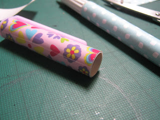
I bought this stationery set from wilkinsons with the intention of redesigning all the packaging for it.

I began by drawing out and measuring each individual item and then drew it up in illustrator using the ruler tool. I then created the designs and used clipping masks to get them to the shape and size I required.
I then used double sided tape to stick my designs to the stationery.
An alternative colour pallette:
The designs on the computer
Thursday, 16 May 2013
Subscribe to:
Comments (Atom)


