
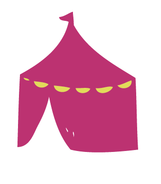
To begin with, like with the other designs I have drawn up some illustrations that fit in with the fragrance/ identity.
Wellies, big top tents and bunting are all definitely things you may find at a festival.


So far this is how my design looks when mocked up onto the can. I still need to add:
- the brand name (batiste dry shampoo) on a banner, like the official existing designs
- the flavour/identity
- try and make the mock-up look more realistic


I think what is making the bottle look so flat is because there is quite a lot of sky, so to break it up I have decided to add these teardrop, almost paisley drawings to the sky to break it up a little.


No comments:
Post a Comment