Batiste Development // Batiste Freedom
Below are my digital experimentation's, you can see that at first I struggled to get it to look right, something just didn't work. I think it was the empty vector outlines of the bird illustrations, it needed more bold colour. The black on blue I thought made a good pattern, but it doesn't tie in with the other designs I have made so far and the colour pallette. I want my designs to be a range, not just random bottles.
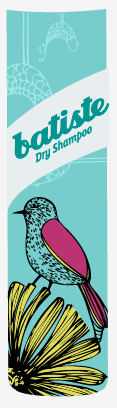
So I experimented a little with the colours I have allowed myself...
As the above illustrations just didn't seem to look right I decided to use some other illustrations I'd done earlier. These illustrations held room to hold more colour than the above one and they just compliment each other well. Also the bird looks more like a bird, the previous illustration looks a bit like a cockerel with really long legs!


No comments:
Post a Comment